 0800 220 009
 Back to Blogs
 Back to Blogs
The Auckland Garage Behind the New McLaren Logo
 September 28, 2026
 MotorShare Team
 2 days
McLaren has a new look for 2026, but one of the most distinctive details in its redesigned logo is anything but new. To find its origins, you have to travel back to Remuera Road in Auckland, where Bruce McLaren grew up above his parents’ service station.
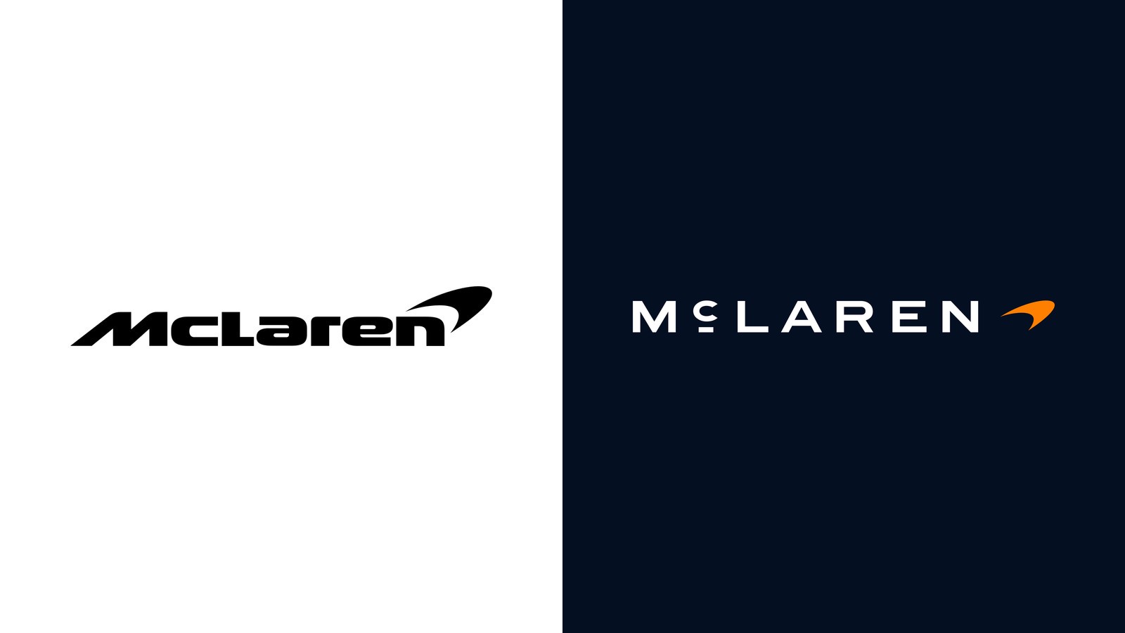
The familiar forward-leaning McLaren lettering has been replaced by wide, upright capitals, with one unusual detail: a smaller C, raised and underlined. It gives the new wordmark its character, but more importantly, it connects modern McLaren directly with the New Zealand beginnings of its founder.
The Auckland Garage Behind the McLaren Name
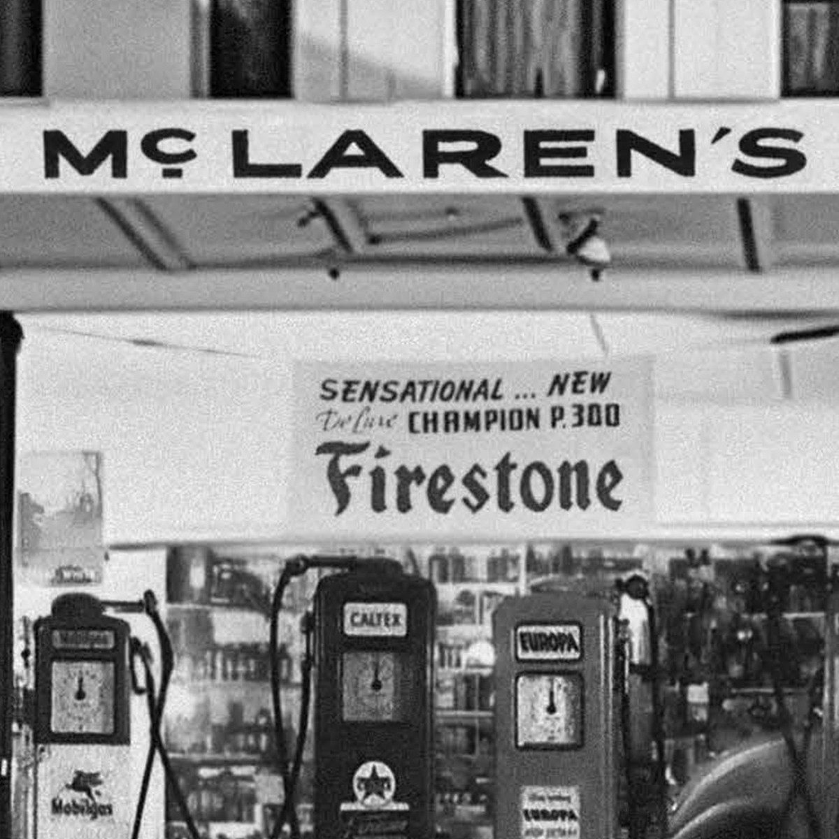
Bruce McLaren’s parents, Les and Ruth McLaren, ran a service station on Remuera Road in Auckland. Bruce grew up in the apartment above it, surrounded by the workshop, cars and machinery that would shape his fascination with engineering and motorsport.
Above the pumps was a large sign reading “McLAREN’S”. Look closely and the connection with the 2026 identity becomes obvious. The sign used broad capital letters, but its C was smaller, raised and underlined, almost exactly the detail that now defines the new McLaren wordmark.
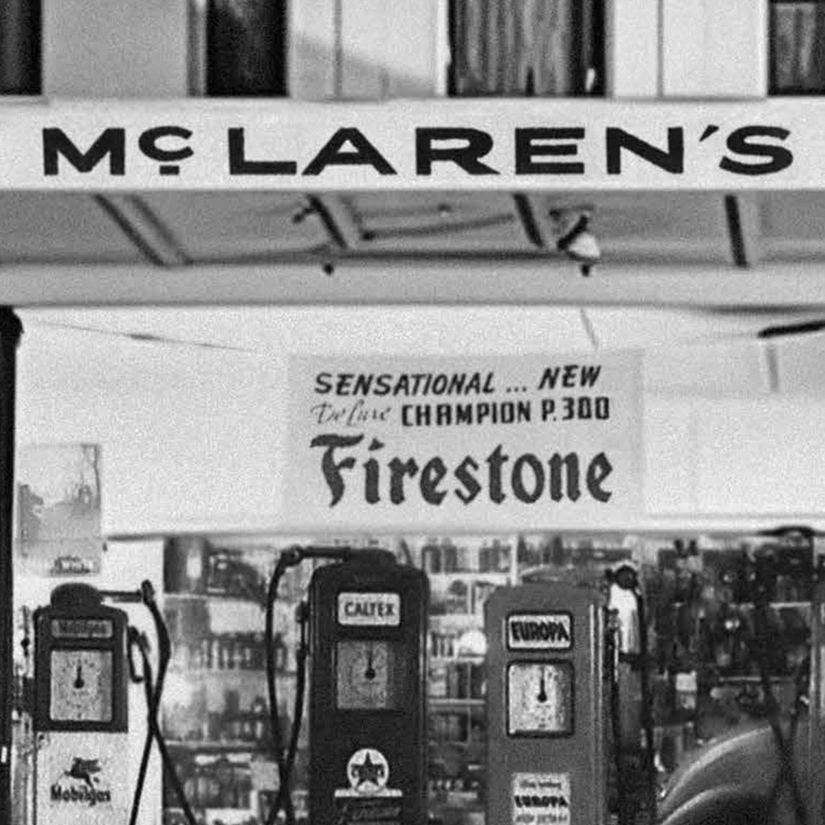
The McLaren family service station on Remuera Road in Auckland, with the original “McLAREN’S” sign that inspired the new identity. Source: © McLaren.
The garage played a bigger role in the McLaren story than simply lending its typography to a future logo. As a teenager, Bruce worked there on a 1929 Austin 7, the car with which he began competing. He would go on to race it at Muriwai, on Auckland’s west coast, before a remarkable career took him from New Zealand motorsport to the international stage.
That makes the redesign an unusual kind of automotive rebrand. Instead of inventing a heritage-inspired graphic decades later, McLaren found one that had been part of the family story all along.
From a Remuera Sign to the Rear of a McLaren
The contrast becomes even more striking when the new lettering appears on a modern car. The McL 6GT, presented at Monterey in August 2026, was the first car to carry the new identity, with the McLaren name written prominently across the rear between the lights.
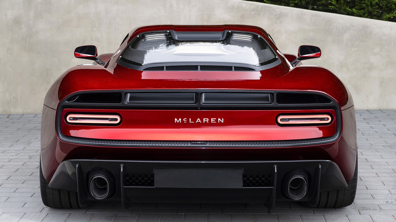
The new McLaren wordmark on the rear of the McL 6GT, presented at Monterey in August 2026. Source: © McLaren Automotive.
It is a neat connection across generations: typography once displayed above a family business in Auckland has found its way onto the bodywork of a modern McLaren.
What Happens to the McLaren Speedmark?
The redesign does not mean the end of the Speedmark. The familiar symbol, introduced in 1997, remains part of the McLaren identity, although its relationship with the name has changed.
Rather than sitting above the lettering, the Speedmark can now appear alongside the wordmark. In McLaren’s racing identity it remains papaya, while the McLaren name takes a more prominent role.
The wider visual identity follows a similar approach. McLaren has created a bespoke typeface called McLaren Sans based on the new lettering, while papaya continues to represent the racing side of the brand. For its road cars, Midnight, a dark blue, takes on a more prominent role.
There are New Zealand references elsewhere in the new palette too. One of its colours is named Muriwai, after the Auckland beach associated with Bruce McLaren’s first victory.
Who Designed the New McLaren Logo?
McLaren has not credited an external design agency with the new identity. The project was developed internally by its creative team under David Woodhouse, Chief Creative Officer of McLaren Automotive.
The result is cleaner and more restrained than the outgoing logo, but the historical reference gives it something many minimalist automotive identities lack: a detail that belongs specifically to McLaren.
McLaren in Auckland Today
For New Zealand enthusiasts, there is another way to connect with the McLaren story. You can experience one of the marque’s modern supercars here in the city where Bruce McLaren’s journey began.
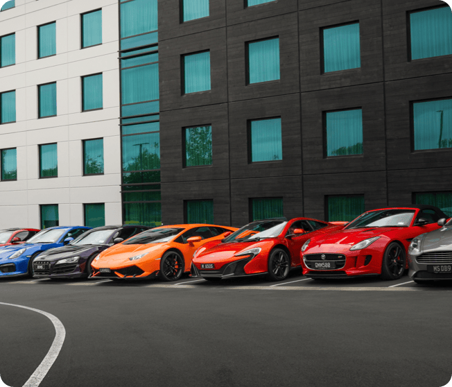
MotorShare’s McLaren 650S Coupé represents an important chapter in McLaren’s modern road-car era, combining a carbon-fibre MonoCell chassis with a twin-turbocharged V8 and the focused engineering approach for which the marque has become known.
If you want to know more about the car before getting behind the wheel, read our feature McLaren 650S: The Pinnacle of Supercar Excellence.
Or, if you would rather experience it for yourself, you can view availability and book the McLaren 650S online with MotorShare.
McLaren New Logo FAQ
What does the new McLaren logo represent?
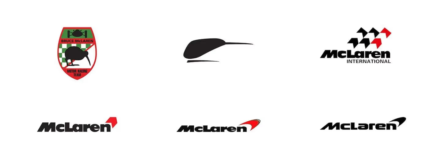
The new McLaren wordmark uses broad geometric capitals with a smaller, raised and underlined C. That distinctive detail is based on the “McLAREN’S” sign that once stood above the service station run by Bruce McLaren’s parents on Remuera Road in Auckland. It also adds another layer to McLaren’s long visual connection with New Zealand. In the early days of Bruce McLaren’s racing team, the cars carried the famous “Speedy Kiwi”, a stylised kiwi that celebrated the founder’s New Zealand roots. McLaren’s identity evolved considerably over the decades, eventually leading to the curved Speedmark introduced in 1997. While today’s Speedmark should not be read literally as a kiwi, the brand’s visual history has long carried references to Bruce McLaren’s Kiwi origins.
Is the McLaren Speedmark disappearing?
No. The Speedmark remains part of McLaren’s identity. It is no longer integrated above the wordmark in the same way and can instead appear alongside the McLaren name, including in papaya for the racing identity.
Is McLaren changing its papaya colour?
No. Papaya remains associated with McLaren racing. The refreshed identity introduces a broader historical palette, including Midnight for the road-car side of the brand and Muriwai, a reference to Bruce McLaren’s early racing history in Auckland.
Back to Where It Started
McLaren’s new identity works because its most recognisable detail was not created in a branding workshop in 2026. It was already there, above a service station in Auckland, decades before McLaren became one of the most famous names in motorsport and supercars.
For New Zealand, that makes this rebrand particularly meaningful. The company may have changed its logo, but in doing so, the McLaren name has gone back to where its story began.
Posts that might interest you

New Zealand's premier destination for luxury, exotic and performance car hire, membership and ownership.

Google Rating
See all our reviews
Head Office
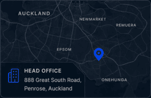
888 Great South Road, Penrose, Auckland
Google Rating
See all our reviews

Download our app


Premium & Insured
All vehicles fully insured for your peace of mind.
Flexible Hire Options
Hourly, daily or long term to suit your plans.
Delivery Available
Airport or city delivery across Auckland.
24/7 Concierge
Our team is here when you need us.
© Copyright 2026 MotorShare Holdings Ltd.




NZTA Licensed
100% Kiwi Owned